
Most free map tools answer one question: how big is this area?
That’s useful. But it’s not enough if the real question is: is this area right for what I need to do?
Whether you’re checking if a delivery zone has enough commercial stops, whether a new service area has public transport coverage, or whether a district is ready for electric vehicles, you need to know what’s inside the zone, not just how large it is.
This article compares the tools that are actually worth your time: what each one does, where it falls short, and which profile it fits best. One of them is Fleet Zone Lab, which is built by Switch, the team behind this article. We’ve included it because it genuinely does something the others don’t; but we’ve kept the comparison honest.
What a zone analysis tool actually needs to do
Before the comparison, a quick framework. A tool earns a place in this list if it handles at least one of these:
- Draw or import a zone: polygon drawing on a map, or import from GeoJSON/KML/Shapefile
- Measure it: area (km² or acres), perimeter, or both
- Tell you what’s inside: infrastructure data: transport stops, points of interest, charging stations, demographics, or similar
The further right on that list a tool gets, the more useful it is for real-world planning decisions. Most free tools stop at the second item.
The tools
Fleet Zone Lab
Free · Browser-based · No install · area-analyst.getswitch.io
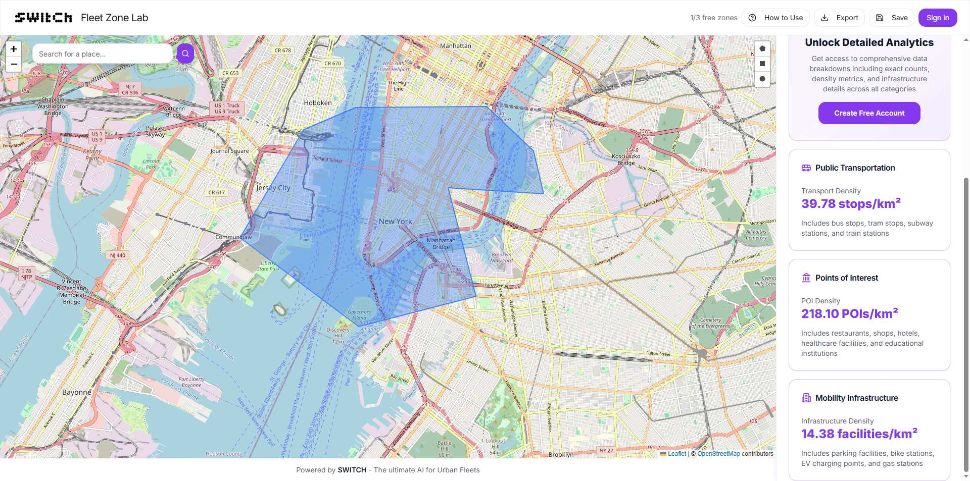
Draw any polygon on the map, or upload a GeoJSON, KML, or Shapefile, and instantly get: area in km², perimeter in km, count of public transport stops inside, points of interest count, and EV charging station count.
That last part is what separates it from everything else on this list. No other free tool in this category gives you live infrastructure density the moment you close a shape. The data updates as you reshape the zone. No export needed to see the numbers.
The free tier covers drawing, uploading, and reading the core metrics. A free account unlocks Detailed Analytics: deeper breakdowns, saved zones, and data export.
Best for: anyone who needs to know what’s inside a zone, not just how large it is. Operations teams, mobility consultants, startup founders validating a market, urban analysts doing a quick feasibility pass.
Limitation: infrastructure data (transport, POI, EV); not demographic or population data. If you need population counts or income brackets, you’ll need a different tool.
Google My Maps
Free · Browser-based · google.com/maps/about/mymaps
The most widely known free mapping tool. You can draw polygons, add markers, import spreadsheets, and share maps with a link. It’s familiar, reliable, and requires nothing beyond a Google account.
The problem: it doesn’t tell you anything about what’s inside your zones. You can draw a boundary, but the only information you get is the shape itself; no area calculation, no infrastructure data, no POI count. It’s a drawing tool, not an analysis tool.
Best for: collaborative map-making, presenting geographic data to stakeholders, annotating locations for internal use.
Limitation: zero analysis. If you need any measurement or insight from your zone, Google My Maps isn’t it.
Smappen
Freemium · Browser-based · smappen.com
Smappen is purpose-built for territory and catchment area analysis. It draws isochrone maps (drive-time or walk-time zones) and radius maps, and overlays demographic data (population, spending, competition) on top.
It’s a genuinely powerful tool for retail site selection, franchise territory planning, and market sizing. The free tier is functional but limited in zone count and data exports.
The key difference from Fleet Zone Lab: Smappen works with radius and drive-time zones, not arbitrary polygons. If your zone follows a real geographic boundary, a district, a city limit, a custom delivery area, you can’t trace it precisely in Smappen. And it doesn’t cover transport stops or EV charging density.
Best for: retail, franchise, and sales territory analysis where demographic data matters more than infrastructure data.
Limitation: polygon drawing is limited; no transport, POI density, or EV charging data; freemium limits hit quickly on the free tier.
QGIS
Free · Desktop · qgis.org
QGIS is the most capable tool on this list by a large margin. It’s a full open-source GIS platform: you can draw any shape, import any data format, run spatial queries, generate heatmaps, overlay multiple data layers, and export professional-grade maps.
The catch is the learning curve. Installing QGIS, adding data sources, configuring projections, and running a basic spatial analysis takes hours if you’ve never used it before. For a team with a GIS analyst, it’s the right tool. For everyone else, it’s overkill for a quick zone check.
Best for: GIS professionals, academic researchers, teams doing complex spatial analysis who need full control over data and outputs.
Limitation: steep learning curve, desktop-only, not designed for quick one-off zone checks.
geojson.io
Free · Browser-based · geojson.io
geojson.io is a lightweight tool for drawing geographic shapes and exporting them as GeoJSON. It’s fast, runs in a browser, and requires no account. The editing interface is clean and the export is immediate.
It does one thing: let you draw shapes and get the coordinates. Area and perimeter aren’t shown by default. There’s no infrastructure data whatsoever. It’s a geometry editor, not an analysis tool.
Best for: developers who need to quickly sketch a zone and get the GeoJSON coordinates for use in an application or API.
Limitation: no measurements, no analysis, no infrastructure data. Purely a geometry drawing and export tool.
Felt
Freemium · Browser-based · felt.com
Felt is a modern, collaborative mapping tool with a polished interface. You can draw shapes, upload data, add layers, and share maps in real time. It’s closer to Google My Maps than to QGIS; but with a significantly better design and collaboration experience.
The free tier is usable for basic map creation. Analysis features, including any infrastructure insights, are behind paid plans.
Best for: teams that need to create and share visually polished maps collaboratively, without GIS expertise.
Limitation: no infrastructure density data on the free tier; analysis features require a paid plan.
Scribble Maps
Freemium · Browser-based · scribblemaps.com
Scribble Maps sits between Google My Maps and Felt: you can draw shapes, import data, and create multi-layer maps. The interface is functional and supports a range of drawing tools including polygons, circles, and drive-time polygons.
Like Felt, the deeper analysis features (data overlays, heatmaps, export) are on paid plans. The free tier is useful for drawing and sharing, not for analysis.
Best for: educators, journalists, and small teams who need a versatile drawing tool with some data import capability.
Limitation: analysis features are paid; no native infrastructure density data.
Quick Comparison
| Tool | Draw polygons | Area + perimeter | Infrastructure data | File upload | Free tier |
|---|---|---|---|---|---|
| Fleet Zone Lab | ✅ | ✅ | ✅ Transport · POI · EV | ✅ GeoJSON, KML | Fully free |
| Google My Maps | ✅ | ❌ | ❌ | ✅ | Free |
| Smappen | Radius/isochrone only | ✅ | Demographics only | ✅ | Limited free |
| QGIS | ✅ | ✅ | With plugins + setup | ✅ All formats | Free (desktop) |
| geojson.io | ✅ | ❌ | ❌ | ✅ GeoJSON | Free |
| Felt | ✅ | ✅ | Paid only | ✅ | Limited free |
| Scribble Maps | ✅ | ✅ | Paid only | ✅ | Limited free |
Choosing by what you actually need
“I need to draw a zone and immediately know what transport, POI, or EV infrastructure is inside it, for free.” → Fleet Zone Lab. It’s the only tool in this list that does this without a paid plan.
“I need to draw a zone fast and get the GeoJSON coordinates for a developer.” → geojson.io. Fastest path from intent to coordinates.
“I need demographic data (population, income, spending) for a catchment area.” → Smappen. Infrastructure data aside, it has the strongest demographic overlay for territory analysis.
“I need full GIS control and have someone on the team who knows how to use it.” → QGIS. No free tool matches its depth.
“I need to create a polished collaborative map to share with a team or client.” → Felt or Scribble Maps. Both have better presentation features than Fleet Zone Lab for that specific use case.
“I need to annotate and share a map with non-technical stakeholders using a familiar interface.” → Google My Maps. Everyone has a Google account.
Frequently asked questions
Is there a free tool that shows what’s inside a geographic zone? Yes. Fleet Zone Lab shows public transport stops, points of interest, and EV charging stations inside any polygon you draw, free, with no account required to get the core metrics.
What is the best free alternative to QGIS for quick zone analysis? For quick, browser-based zone analysis without installation, Fleet Zone Lab covers the most common use case (draw a zone, see infrastructure density) in the shortest time. For full GIS analysis, there is no direct free alternative to QGIS; but for most operational zone checks, you don’t need that level of depth.
Can I upload a GeoJSON file and see what’s inside? Fleet Zone Lab, QGIS, Felt, and Scribble Maps all accept GeoJSON uploads. Fleet Zone Lab is the only one that immediately shows infrastructure density (transport, POI, EV) after upload without any additional configuration.
What’s the difference between Fleet Zone Lab and Google My Maps? Google My Maps lets you draw and annotate zones but provides no measurement or infrastructure analysis. Fleet Zone Lab gives you area, perimeter, and a live count of transport stops, POIs, and EV charging stations the moment you close a shape.
The bottom line
If the question is “how large is this area?”, almost any tool on this list works.
If the question is “what’s in this area, and is it ready for what I need?”, Fleet Zone Lab is the only free option that answers it directly.
Draw a zone, upload a file, and read the infrastructure data in under two minutes. No account needed to start.