
The boundary is the easy part.
Most operations teams can draw a delivery zone in minutes, a rough polygon on a map, a radius from a depot, an inherited territory from the previous manager. What they rarely know, before vehicles and staff are already allocated, is what that zone actually contains.
How many commercial stops are inside? Is the area dense with points of interest or mostly residential? Are there public transport corridors that will generate predictable congestion at specific hours? Is the infrastructure mature enough to support electric vehicles on that route?
These aren’t abstract questions. They directly affect stop rates, delivery times, vehicle utilisation, and whether a zone that looks reasonable on a map actually works in practice.
This article covers how to answer them before you commit, using free tools, without a GIS background.
What zone analysis tells you that a boundary doesn’t
A zone boundary tells you where operations stop and start. Zone analysis tells you what you’re working with inside that boundary.
The two most useful signals for delivery and service zone planning are POI density and transport infrastructure.
POI density is a proxy for operational complexity. A zone with a high concentration of commercial points of interest, shops, offices, restaurants, services, will generate more stops per km², more time spent finding parking or access points, and more variability in delivery windows. A zone with low POI density is simpler to serve but may not justify the cost of coverage.
Neither is inherently better. The question is whether the density matches your model, and whether you knew what it was before committing.
Transport infrastructure tells you two things: how accessible the zone is for customers or recipients, and where congestion is likely to build. A zone with high bus and tram stop density is well-connected, which is good for footfall-dependent services, but also means more pedestrian and vehicle traffic at predictable times.
For electric fleets, a third signal matters: EV charging station density inside or adjacent to the zone. This tells you whether the infrastructure exists to support an electric vehicle on that route without route deviations for charging.
The four questions to answer before finalising a zone
Before allocating resources to any delivery or service zone, you should be able to answer:
1. How large is it, exactly? Not an estimate, the actual area in km² and perimeter in km. These directly affect the number of vehicles needed to cover the zone efficiently and the kilometres driven per shift.
2. What is the POI density? Commercial and service locations per km². This sets expectations for stop frequency and average time per stop.
3. How is it connected? Number of public transport stops inside the zone. High connectivity can mean both higher demand and predictable congestion windows.
4. Is the EV infrastructure there? If you’re operating or planning to operate electric vehicles, the charging station count inside or near the zone tells you whether recharging during or after a shift is operationally feasible.
How to run a delivery zone analysis: step by step
You don’t need GIS software for this. The workflow below takes under five minutes.
Step 1: Open Fleet Zone Lab Go to area-analyst.getswitch.io. No account required to run the analysis.
Step 2: Draw your zone or upload an existing file If you’re evaluating a new zone, click the draw tool and trace the boundary on the map. Click to place each vertex, close the shape to complete it.
If you already have the zone defined as a GeoJSON, KML, or Shapefile, upload it directly using the import button.
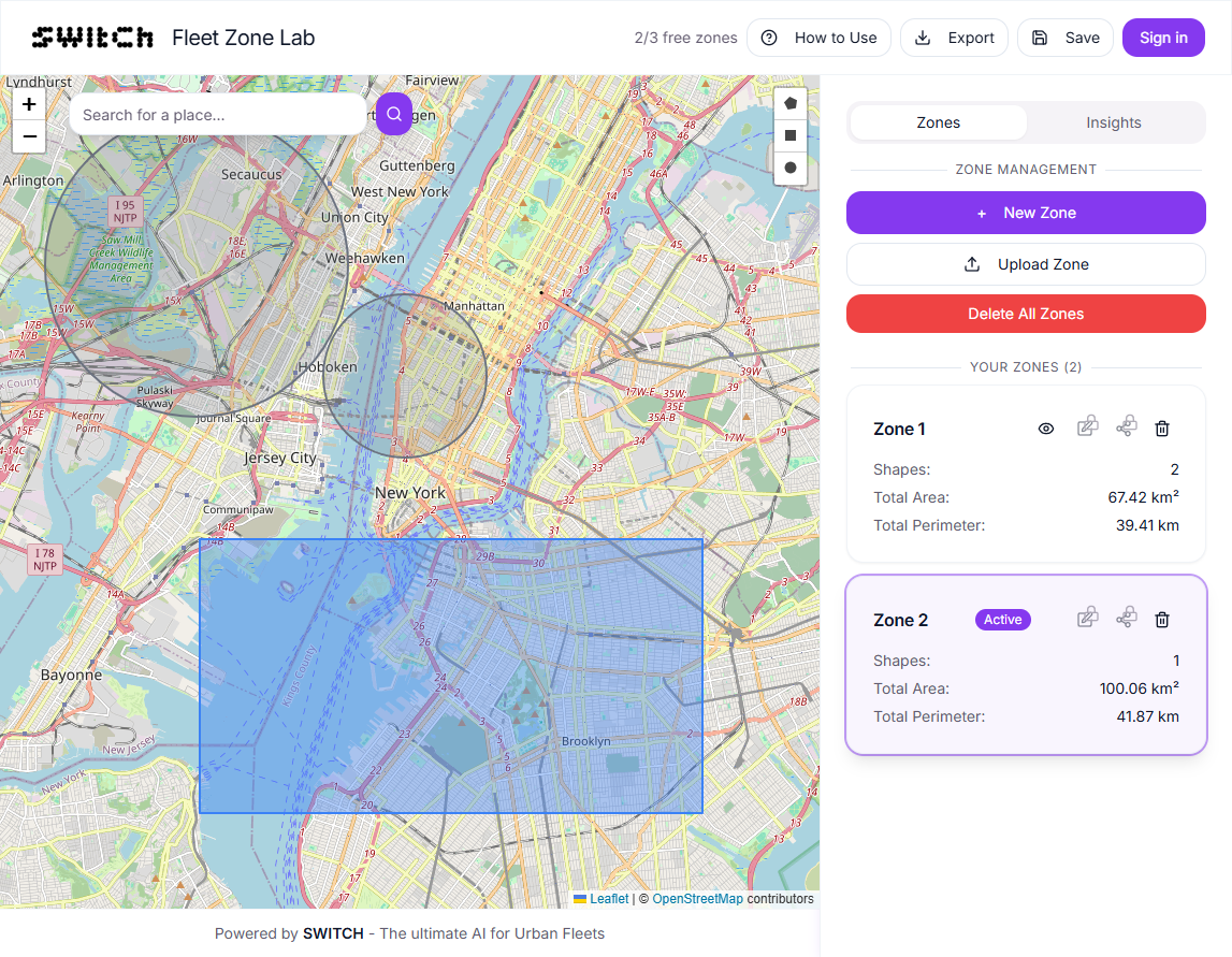
Step 3: Read the core metrics Once the shape is closed, the sidebar shows:
- Area: the zone size in km²
- Perimeter: the boundary length in km
- Transport stops: public transport stops (bus, tram, metro) inside the zone
- Points of interest: commercial and service locations inside the zone
- EV charging stations: public charging points inside the zone
These update live as you adjust the boundary.
Step 4: Adjust and re-read Delivery zones are rarely finalised on the first draw. Drag vertices to refine the boundary, cut out a low-density residential area, extend into a commercial block, and watch the metrics update in real time. This is where zone analysis earns its value: you can test boundary changes immediately, without re-running a query or waiting for an export.
Step 5: Compare candidate zones If you’re choosing between two or more zones, or splitting a large territory into sub-zones, draw each one and note the metrics. The comparison is what turns data into a decision.
Reading the results: what the numbers mean
The raw numbers need context. Here’s how to read them for delivery zone planning.
POI count, what to look for There is no universal benchmark: a POI count of 400 in a 2 km² zone is very different from 400 in a 10 km² zone. What matters is POI per km², density, not total count. A high-density zone (say, above 150 POIs/km²) will behave like a city centre: high stop frequency, slower average speed, more dwell time. Plan accordingly.
Transport stops, what to look for A high stop count (relative to zone size) indicates a well-connected urban area. Operationally, this means more pedestrian crossings, more bus pull-ins, and more double-parked vehicles at peak times. Useful to know before scheduling morning delivery windows.
EV charging stations, what to look for If you’re evaluating a zone for EV vehicles, look for at least one fast charger (DC) within or immediately adjacent to the zone. The total count matters less than charger type and proximity to your operational base.
Perimeter-to-area ratio, a useful proxy Divide the perimeter by the area. A high ratio (long boundary relative to area) indicates an irregular shape, which usually means more edge-case deliveries, harder navigation, and less efficient routing. A compact zone with a lower ratio is generally easier to serve.
Comparing multiple zones
The clearest use of zone analysis is side-by-side comparison.
Draw Zone A. Note the metrics. Clear it (or save it with a free account). Draw Zone B. Compare.
You’re looking for the zone where POI density matches your service model, infrastructure supports your vehicle type, and the shape is compact enough to route efficiently. That combination rarely appears on a map alone, you need the numbers.
Frequently asked questions
How do I check what’s inside a delivery zone for free? Draw your zone in Fleet Zone Lab at area-analyst.getswitch.io. The tool immediately shows the count of points of interest, public transport stops, and EV charging stations inside the boundary, free, no account needed.
What is POI density and why does it matter for delivery zones? POI (point of interest) density is the number of commercial and service locations per km² inside a zone. It’s a reliable proxy for stop frequency, the more POIs per km², the more deliveries or service calls you can expect to make in that area, and the more complex the routing tends to be.
Can I upload an existing zone file instead of drawing it? Yes. Fleet Zone Lab accepts GeoJSON, KML, and Shapefile uploads. If your zone is already defined in one of these formats, you can import it directly and get the analysis without redrawing.
How do I compare two delivery zones? Draw the first zone in Fleet Zone Lab and note the metrics. Either clear the zone and draw the second one, or save the first with a free account and draw a second for comparison. The metrics panel updates for each zone you draw.
Is this useful for electric vehicle route planning? Yes. The EV charging station count inside the zone tells you whether the charging infrastructure exists to support an electric vehicle operating in that area. Combined with the zone area and perimeter, you can estimate whether the route can be completed without a charging stop or whether one is needed, and whether the infrastructure is there to support it.