Every expansion decision starts with a hunch.
A city looks right. The demographics feel promising. Someone on the team has a contact there. The competition seems thin on the ground. These are reasonable signals; but they are not a validation. They are a hypothesis.
Validating a geographic market means checking whether the physical infrastructure of a place actually supports your operating model before you invest in finding out the hard way. It is faster than it sounds, cheaper than hiring a consultant, and more defensible than a slide that says “strong market fundamentals.”
This article covers a practical framework for doing it, using publicly available map data, a free zone analysis tool, and about thirty minutes.
Why infrastructure data is the right starting point
Market validation frameworks usually focus on demand: population size, income levels, competitor presence, search volume, survey data. These matter. But for businesses that operate physically in a geographic area, mobility services, logistics, delivery, field operations, urban tech, demand data without infrastructure data is half the picture.
A city with strong demand but no EV charging infrastructure is a different challenge for an electric fleet operator than one where charging is embedded. A district with high commercial density but poor public transport access behaves differently for a service that depends on footfall. A zone that looks compact on a map but has an irregular, high-perimeter boundary is more expensive to cover than one with a tight, efficient shape.
Infrastructure data answers the question demand data can’t: can we actually operate here?
It also has a practical advantage: it is objective, replicable, and available for free. Two people drawing the same zone around the same city get the same numbers. That matters when you are building a case for a board, a co-founder, or an investor.
The four infrastructure signals that matter
Not all infrastructure data is equally relevant to every business model. These four signals cover the most common cases.
1. Zone area and shape efficiency The size of your target zone in km² directly affects operational cost, the number of vehicles, staff, or touchpoints needed to cover it. But size alone is misleading. A 10 km² zone that is compact and roughly circular is cheaper to serve than a 10 km² zone that is long, narrow, and irregular.
The perimeter-to-area ratio is a useful proxy for shape efficiency. A compact zone, say, 2.5 km of perimeter per km², routes and covers more efficiently than a sprawling one at 5 km of perimeter per km². Measure both.
2. Public transport stop density Transit stop density tells you how connected a zone is to the wider city. For mobility services, it indicates whether customers can realistically reach your service without a car. For logistics, it is a congestion signal: high transit density means more pedestrian and vehicle conflict at predictable times.
A zone with high transit density (above 8 stops/km² in a European urban context) is a different operating environment than one with 2 stops/km². Know which you are entering.
3. Points of interest density Commercial and service POI density is a proxy for economic activity in the zone. For delivery and last-mile services, it indicates stop frequency, how many destinations exist per km². For mobility services, it suggests footfall-generating locations. For any business that depends on people being in a place for a reason, POI density is the closest free substitute for footfall data.
4. EV charging station density For operations involving electric vehicles, charging density inside or adjacent to the zone tells you whether the infrastructure is in place, or whether you would be building ahead of it. A zone with a density above 3–5 stations/km² in a European city has a mature enough charging base for most fleet use cases. Below 1 station/km² and you are in early-infrastructure territory.
The framework: four zones, four numbers, one decision
The most useful output of a geographic market validation is not a single city score, it is a comparison across candidate markets or candidate zones within a market.
The process:
Step 1: Define your candidate zones Identify two to four cities or districts you are evaluating. For each, define the specific area you would operate in; not the city at large, but your actual target zone. This might be a city centre, an inner borough, an airport corridor, or a logistics district.
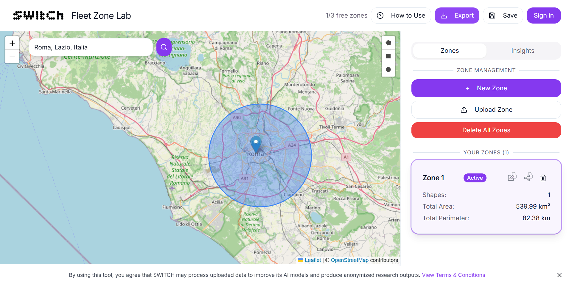
Step 2: Draw each zone and read the four signals For each candidate, open Fleet Zone Lab, draw the zone boundary, and record:
- Area (km²)
- Perimeter (km) → calculate perimeter/area ratio
- Public transport stops (→ stops/km²)
- Points of interest (→ POI/km²)
- EV charging stations (→ stations/km²)
This takes five to ten minutes per zone.
Step 3: Build the comparison table Transfer the numbers into a simple table:
| Signal | Zone A | Zone B | Zone C |
|---|---|---|---|
| Area (km²) | – | – | – |
| Perimeter/area ratio | – | – | – |
| Transit stops/km² | – | – | – |
| POI/km² | – | – | – |
| EV stations/km² | – | – | – |
You now have an infrastructure fingerprint for each candidate. The zone that scores best across the signals relevant to your model is the better-supported market, independent of how it “feels.”
Step 4: Weight by what your model actually needs The signals are not equally important for every business. An EV fleet operator weights charging density heavily. A last-mile logistics company weights POI density. A shared mobility startup weights transit access.
Assign weights to each signal based on your model, multiply, and rank. The output is an evidence-based ranking that you can defend in a board meeting or investor conversation without reaching for instinct.
What this framework is and isn’t
It is: a fast, free, objective first-pass filter for geographic market selection. It replaces the “feels right” stage with a structured infrastructure check that takes an afternoon, costs nothing, and produces shareable data.
It isn’t: a substitute for on-the-ground research, regulatory due diligence, competitive analysis, or demand validation. Infrastructure data tells you whether a market can support your operations. It does not tell you whether customers want what you offer, whether permits are obtainable, or whether a local incumbent will undercut you on day one.
Use it as a gate, not a guarantee. A zone that fails the infrastructure check is worth deprioritising. A zone that passes still needs the rest of the validation work; but now you are doing that work in the right places.
Presenting the results
One underappreciated use of this framework: the output is immediately presentable.
A table of four candidate cities with five infrastructure metrics each, built from open data and a free tool, is a credible slide in a pitch deck, a board report, or an internal strategy review. It shows that the market selection was not arbitrary. It shows that someone checked whether the infrastructure exists before asking for budget to enter the market.
That slide, infrastructure comparison, methodology footnote, tool cited, takes thirty minutes to build and considerably more than thirty minutes to explain away if you didn’t build it.
Register for a free Fleet Zone Lab account to save your zones, reload them for future comparisons, and export the data directly into your reporting format.
Frequently asked questions
How do I validate a new geographic market without hiring a GIS consultant? Draw your candidate zones in Fleet Zone Lab at area-analyst.getswitch.io and read the infrastructure signals, zone area, transit stop density, POI density, and EV charging density, for each. The data is free, objective, and takes under ten minutes per zone to collect.
What infrastructure data matters most for market entry validation? It depends on your model. For electric fleet operations, EV charging density is the critical signal. For last-mile delivery, POI density predicts stop frequency. For mobility services that depend on footfall, transit stop density indicates connectivity. Zone shape efficiency (perimeter-to-area ratio) is universally relevant.
Can I export the zone analysis data for a pitch deck or board report? Yes, with a free Fleet Zone Lab account. Registration unlocks Detailed Analytics, including data export in formats suitable for reports and presentations.
How many candidate zones should I compare? Two to four is a practical range. Fewer than two gives you no comparison baseline. More than four and the comparison table becomes difficult to act on. If you are evaluating a larger set of candidates, run a quick first pass on all of them and use the infrastructure scores to shortlist to three or four for deeper analysis.
Is this approach used by professional analysts? Infrastructure density analysis is a standard component of site selection and territory analysis in commercial real estate, retail network planning, and logistics. The methodology is conventional, what changes here is the tooling: open data and a free browser-based tool replace paid GIS platforms and consultant hours for the first-pass analysis.
Does this work for markets outside Europe? Yes. Fleet Zone Lab works globally. Data coverage for transit stops, POIs, and EV charging stations is strongest in Western Europe, North America, and major Asian cities. In markets with less developed open data infrastructure, some signals may be incomplete, factor this into the interpretation.
Thirty minutes. Five numbers. A better decision.
Geographic market selection doesn’t have to be a gut call dressed in optimistic slides.
Draw your candidate zones. Read the infrastructure signals. Build the comparison. The market that looks right and checks out on the infrastructure data is a meaningfully stronger bet than the one that just looks right.
Start your market analysis free →
Draw your candidate zones and read the infrastructure data instantly. Register free to save zones and export results for your reports.