
There is a question that comes up in urban planning meetings, site selection decisions, corporate mobility reviews, and startup pitch decks, and it almost always gets answered with an approximation:
“How well is this area served by public transport?”
The honest answer is almost never available in the room. Someone will say “there’s a bus line nearby” or “it’s well connected”, which could mean anything from three stops per km² to thirty. The approximation gets written into a slide. The decision gets made on it.
This article is about replacing the approximation with a number. Specifically: how to measure transit stop density in any geographic area, in under five minutes, using a free browser-based tool.
Who needs to measure transit coverage and why
The use cases are broader than you might expect.
Urban and mobility consultants need transit coverage data to support planning recommendations, feasibility studies, and infrastructure gap analyses. Getting it quickly, without a full GIS workflow, makes the difference between a 20-minute desk check and a two-hour data pull.
Corporate mobility managers working on sustainable mobility plans or mandatory commute plans (such as the PSCL in France and Italy, or equivalent schemes in the UK and Germany) need to demonstrate that public transport is a viable alternative to car commuting in their area. The data has to be specific to their zone, not a city-level average.
Mobility startups evaluating cities for market entry need transit density as one signal of market maturity. A city with dense, well-distributed transit is a different operating environment than one where public transport is sparse and unreliable.
Real estate and site selection teams use transit access as a scoring factor for office locations, mixed-use developments, and logistics hubs. Proximity to a transit stop is a coarse measure; transit stop density in the catchment area is a more useful one.
Operations teams planning delivery or service zones benefit from knowing where transit-driven congestion is likely to cluster, particularly around high-frequency stops during peak hours.
The common thread: the question is always about a specific area, not a city average. City-level transit statistics are widely available. Zone-level transit density, for an arbitrary boundary you define, is not, unless you measure it yourself.
What transit stop density actually tells you
A single transit stop near the edge of your zone tells you very little. Transit stop density, stops per km², tells you something meaningful.
High density (roughly above 8–10 stops/km² in a European urban context) indicates a well-connected urban area with overlapping bus, tram, or metro routes. This correlates with walkable streets, high pedestrian traffic, and zones where people are likely to arrive without a car.
Medium density (3–8 stops/km²) is typical of inner suburban areas: served, but with gaps. Not every point in the zone is within comfortable walking distance of a stop.
Low density (below 3 stops/km²) indicates areas where public transport is a fallback option rather than a primary mode. Car dependency is higher. Foot traffic will be lower and less predictable.
These benchmarks vary significantly by country, city, and context. A number that reads as “high” in a mid-sized German city may read as “low” in central Paris. Use them as orientation, not as absolute thresholds.
One number that matters as much as the count: the distribution of stops within the zone. Thirty stops clustered along one corridor tell a different story than thirty stops spread evenly across the area. Fleet Zone Lab shows the count; validating the distribution means looking at the map alongside the number.
How to measure transit stop density in a custom zone
Step 1: Open Fleet Zone Lab Go to area-analyst.getswitch.io. No account needed to start.
Step 2: Define your zone Draw the boundary directly on the map using the polygon tool, click to place vertices, close the shape to complete it. If your zone already exists as a GeoJSON, KML, or Shapefile, use the upload button to import it.
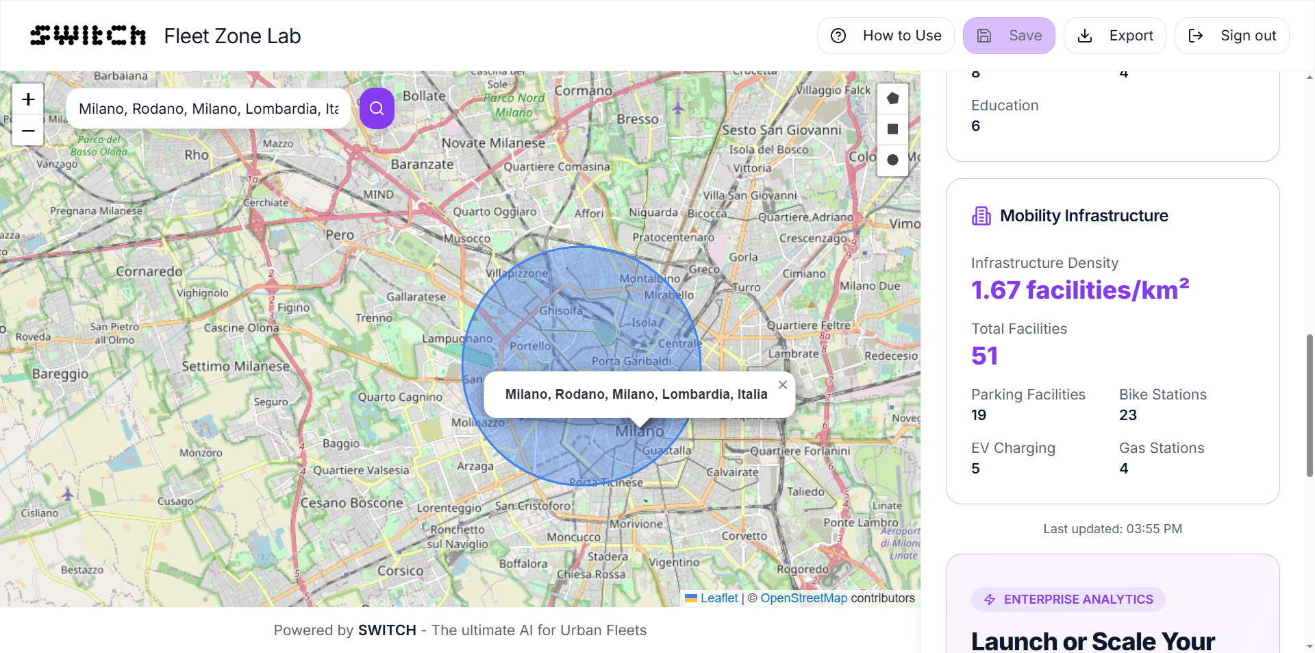
Step 3: Read the transit stop count The sidebar shows the number of public transport stops inside your zone the moment the shape closes. This includes bus, tram, and metro stops, all surface and underground transit with a fixed stop location.
Step 4: Calculate density Divide the stop count by the zone area in km². That’s your transit stop density. If the zone is 3 km² and contains 24 stops, the density is 8 stops/km².
Fleet Zone Lab gives you both numbers directly, stop count and area, so the calculation is a single step.
Step 5: Adjust the boundary or compare zones Drag any vertex to refine the boundary. The stop count updates in real time. To compare transit coverage across two candidate zones, draw each separately and note the metrics.
Reading the results alongside other signals
Transit stop density on its own is a useful number. Combined with the other metrics Fleet Zone Lab provides, it becomes a fuller picture.
Transit stops + POI density High transit access and high POI density together indicate a commercially active, well-connected zone, the profile of a high-footfall urban area. High transit but low POI may indicate a commuter corridor with limited commercial activity. The combination matters for understanding whether transit access translates into actual footfall.
Transit stops + EV charging stations In zones where you’re planning or evaluating electric vehicle operations, transit stop density and EV charging density together indicate the mobility profile of the area: how people move through it, and what infrastructure exists to support different vehicle types.
Transit stops + zone area and perimeter A large zone with high transit density tells a different story than a small zone with the same count. Always normalise by area. And a zone with a high perimeter-to-area ratio, an irregular, stretched shape, may have transit stops clustered in one part while other sections are underserved.
What the data can’t tell you
Transit stop count is a supply-side measure. It tells you how many stops exist inside your zone, not how frequently services run, how reliable they are, or how far each stop is from the nearest point of interest.
Two zones with identical stop counts can have very different transit experiences: one served by high-frequency metro and tram lines, the other by two infrequent bus routes. The count is a starting point, not a conclusion.
For frequency and reliability data, the relevant sources are national or regional GTFS feeds (open in most European countries), local transit authority open data portals, and tools like Transitland or OpenTripPlanner. These require more setup than a five-minute zone analysis, but they answer the follow-on questions that a stop count raises.
Use Fleet Zone Lab to establish whether a zone is worth investigating further. Use deeper data sources to validate what you find.
Frequently asked questions
How do I check how many bus stops are in a specific area? Draw your area in Fleet Zone Lab at area-analyst.getswitch.io. The tool immediately shows the count of public transport stops (bus, tram, metro) inside any polygon you draw, free, no account needed.
What is a good transit stop density for an urban area? Context-dependent, but as a rough guide for European cities: above 8–10 stops/km² indicates a well-connected urban area; 3–8 stops/km² is typical of inner suburban zones; below 3 stops/km² suggests limited transit access. These thresholds vary significantly by country and city type.
Does Fleet Zone Lab count bus stops, tram stops, and metro stops separately? The tool shows a combined count of public transport stops within the zone. For a breakdown by transit type, use the Detailed Analytics tier (unlocked with free registration) or cross-reference with local transit authority open data.
Can I use this for a corporate mobility plan or commute analysis? Yes. If you need to demonstrate transit access for a specific workplace catchment area, for a sustainable mobility plan, a PSCL, or a site selection report, draw the relevant zone and use the stop count and density as supporting data. Export the results with a free account.
How accurate is the transit stop data? The data reflects public transport stops from open data sources, updated regularly. Coverage is strongest in Western and Northern Europe, major North American cities, and other regions with well-maintained open transit data. In areas with limited open data availability, counts may be incomplete.
What if I want to analyse transit frequency, not just stop count? Fleet Zone Lab measures supply (how many stops exist). For frequency data, the best free sources are national GTFS feeds, local transit authority portals, and tools like Transitland. Use Fleet Zone Lab to shortlist zones worth investigating, then validate with frequency data.
A more useful number in the room
The next time the question is “how well is this area served by public transport?”, it doesn’t have to be answered with an approximation.
Draw the zone. Read the stop count. Divide by the area. You have a number, and a number is a better basis for a decision than a feeling.
Check transit coverage in your zone free →
Draw your area, get the transit stop count instantly. Register free to save zones and export results.